President Dwight D. Eisenhower didn't use the term "Military Industrial Complex" until 1961, but the notion of industry playing a dual role of defense contractor and supplier of domestic goods is telegraphed in many of the ads that appeared in Fortune magazine a decade earlier.
Also intriguing are the multitude of ads that signaled the dawn of the technological age - and the fervor with which industry embraced its role in steering America to its manifest destiny of world leadership through scientific advancement...
... atomically fused to the tenets of capitalism.
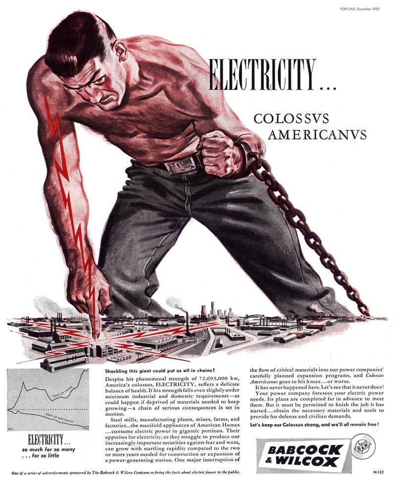
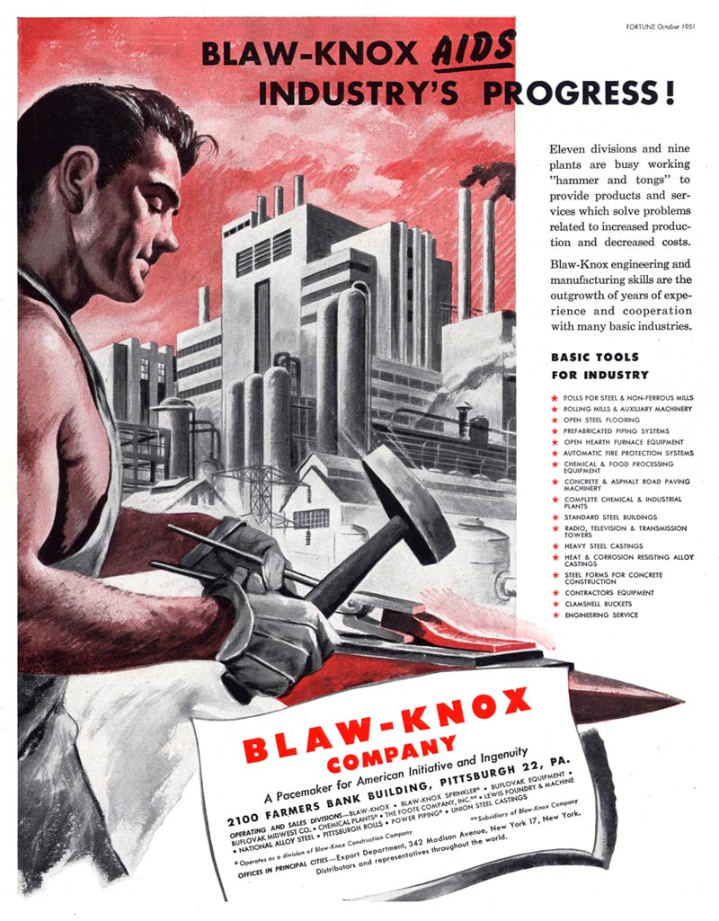
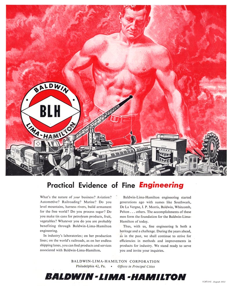
And that philosophy reveals a particularly amusing irony of mid-century industrial advertising, because this bastion of Capitalism thoroughly embraced the style and symbolism of Communist propaganda art: the handsome, noble, bare chested worker, heroically pounding away with a hammer on hot iron; beating swords into ploughshares while glorious factories rise all around him.
I mean really, if it was "better to be dead, than red"...
... what's with the preponderance of red in these ads?
* My Industry Flickr set.
These industrial illustrations really drive the point home that the U.S. was very much Caucasian dominant not that many years ago. I guess the only way a guy like me (an African-American) could have found his way into one of these amazing pieces of art is by holding a stack of pancakes. LOL.
ReplyDeleteBut seriously great art. How sad to realize the Era of American Illustration lasted a fleeting short century.
I love the electricity guy, what a great idea!
ReplyDeleteSo why do tou think the Communist style was appropriated by American illustrators here? It seems to me that the propaganda was so similar in terms of what its aims were that it just had to use the same vessel for carrying its ideas.
Les; You're right -- it is a shame, both that the golden age of illustration was so abbreviated and that African-Americans are so underrepresented in mainstream illustration ( or are presented as stereotypes ). I've noticed on ebay when I'm sourcing old mags that there was at least one mainstream magazine targeted towards the Black community (Jet magazine). I have never had the chance to flip through one, but I've always wondered if there were other similar magazines (almost like magazine segregation, which unfortunately sort of makes sense for that era) and if there was parallel targeted illustration done for that market featuring African-Americans in the leading roles. Maybe someone will be able to let us know. If I'm correct about that, it would make a fascinating topic for the blog!
ReplyDeleteDajda;
ReplyDeleteOf course I'm being somewhat facetious about that, but there is a kernel of truth to it, imo. I believe you're absolutely right - the style of Communist propaganda art was simply too effective to try to improve upon -- the irony is in the fact that those most vehemently opposed to Communism created these ads that are so reminiscent in style and message to those of their sworn enemy.
That 'sameness', was a lot of the reasoning of the politics behind enacting American art movements of the Era, like Abstract Expressionism; That to foster a distinctly separate and different American notion/ideal/imagery, required making a distinctly 'not the same' art.
ReplyDelete