LP: The guy who seems to have been a huge influence on everybody at the time was Al Parker.
JB: Oh yeah.
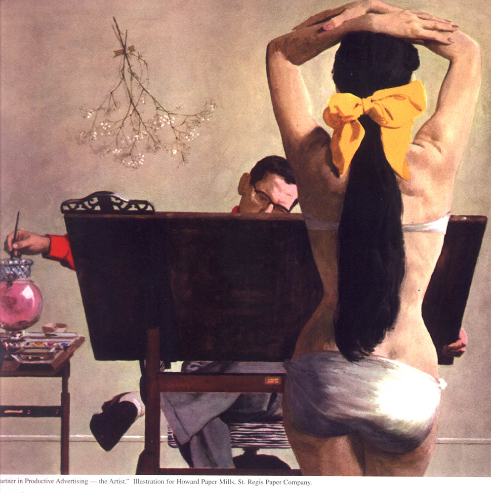
(Below, Al Parker promo illustration for Howard Paper Mills, year unknown)
LP: Was he someone whose work you were looking at?
JB: Absolutely. Al Parker was the favourite of all the artists at Cooper's. In fact we went to the old book stores and bought the old magazines and kept an incredible file on Parker. He was the major changer of the way illustration looked, from the oil painting period to the whole 'designed double page spread' type of thing.
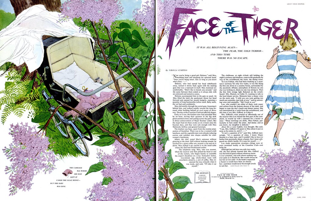
(Below, Al Parker DPS from Ladies Home Journal, June 1958)
I remember one time I delivered a job to, I think it was John English - he was the art director at Good Housekeeping before Suran Ermoyan - and another package came in while he was looking at mine and he says, "Oh, that's from Parker." And my mouth was watering as he opened it. (we both chuckle)
(Below, Al Parker illustration from Good Housekeeping, 1950s)
And he opened it and I said, "Oh man, look at that." and he shook his head. I said, "What's the matter?" and he said, "You know; I love it, you love it, all the artists love it... but I get very little reaction from the public to Parker's work."
And he never really had that 'mass-appeal'. Even though he did those beautiful mother-daughter covers for Ladies Home Journal for all those years...
... he never really had the sort of name where you could go out on the street and ask anybody. They'd tell you Coby and Jon Whitcomb and Norman Rockwell, but if you said, "What about Al Parker?" they'd say, "Who?"
(Below, Al Parker illustration, year and publication unknown)
LP: Do you think that was because Parker's women weren't so idealized as Jon Whitcomb's or Coby's?
JB: Yes. Very much so. He wasn't a glamour illustrator and that's what they [the public] were looking for.
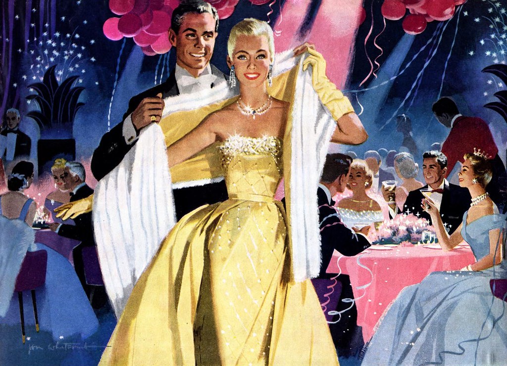
(Below, Jon Whitcomb illustration, Saturday Evening Post, 1956)
JB: Rockwell was all homespun and small town and Jon Whitcomb was the premier glamour illustrator, as was Coby and a bunch of them. Because of my relationship with Coby, I just gravitated towards that.
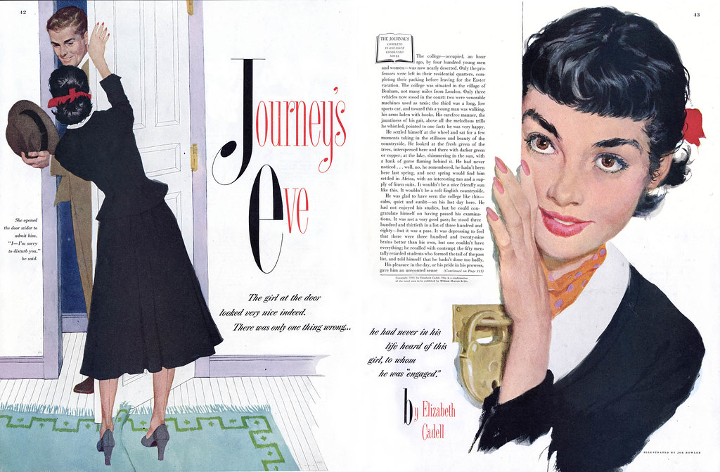
(Below, Joe Bowler DPS from Ladies Home Journal, March 1953)
JB: Parker was one of the most creative minds in the business. Every time he did an illustration you just went, "Wow!"
LP: Did you ever have a chance to meet Al Parker?
JB: Oh yeah, sure. At the Society of Illustrators. I didn't know him well but every now and then he'd be up for lunch. In fact one time I was having a drink at the club after lunch and it got to be the cocktail hour and all these famous guys happened to be up there... Al Dorne and Parker and a bunch of others. And they all decided to go out to eat and I decided to trail along. And I remember we were all standing at a light at 61st and Lexington Avenue when Al Dorne stopped and said, "You know, we oughta start a correspondence school." And they all said, yeah, and started to talk about it. And I realized later that that was the first time they seriously talked about it. I always sort of thought, "Wow, I was standing there at the beginning of the Famous Artists School!"
LP: Wow. And to think; at that moment you were standing there, nobody would have imagined that it would go on to generate millions upon millions of dollars.
JB: Yeah.
LP: Now, there's a passage in Neil Shapiro's article on the Cooper studio - and I've heard this directly from Murray Tinkelman as well - that late in the 1950s there was one of these 'bounced jobs' that came in for corrections. And that everybody gathered around this painting and that you looked at it and said, "I dunno who did this but the business is never gonna be the same."
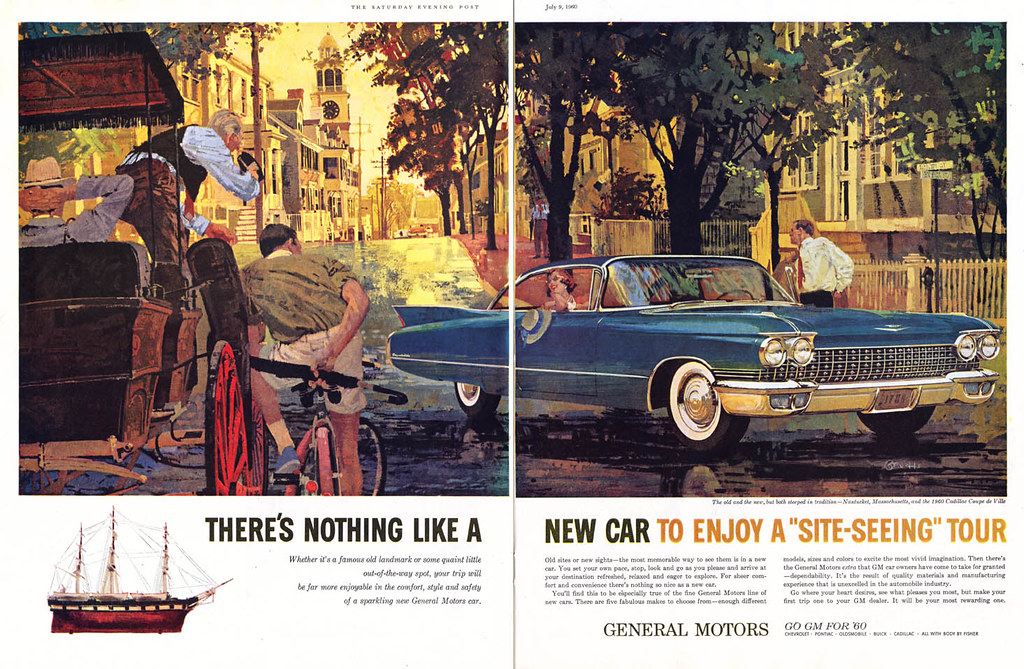
JB: Oh I remember that... it was for Ford. We'd done the Ford cars in the studio, plus the figures - I would do the figures and Al Baxter was the car man. Then all of a sudden this thing showed up. And that was Bernie Fuchs.
(Below, auto ad by Bernie Fuchs, 1959/'60)
LP: And what was it about that painting that made you - ?
JB: It was the way he portrayed the attitudes of the people. They were... 'real'. They were not posing. We always had expressions and hands flying and doing all this kinda stuff. But he would just go out and photograph a bunch of people 'hangin' around!' (Joe laughs) And then he'd paint 'em that way and it looked so great. That was really the big difference.
(Below, Bernie Fuchs advertising illo, 1960)

LP: So did Fuchs' work influence you at that point? Did you start looking for it?
JB: Well, I looked for it because I loved it - but that was when I started to see a bunch of people imitating Bernie Fuchs. I think I said it in an interview once, after that, every month it was like, "Can you top this?" and somebody'd come up with a new technique. And all of a sudden everybody was trying to be Bernie Fuchs.
LP: Right.
JB: And I couldn't be. I went the other way. I went more and more traditional. The influence was to do consistently wonderful work, but he didn't influence me on my style.
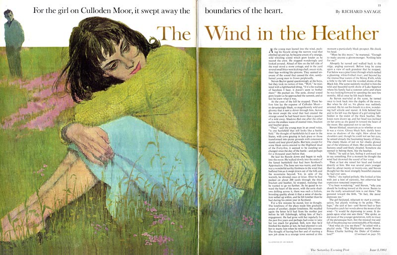
(Below, Joe Bowler DPS from the Saturday Evening Post, June 1962)
LP: I know exactly where you made that statement: it was in a 1967 interview in American Artist magazine.
JB: Oh yes!
LP: In there you said, "I keep up with all the new media, the new techniques. Like everybody else, I use acrylics. I experiment with collage and all sorts of accidental effects. I use cameras and projection equipment. But I'm always myself. I don't let any of this take over and become technique for it's own sake."
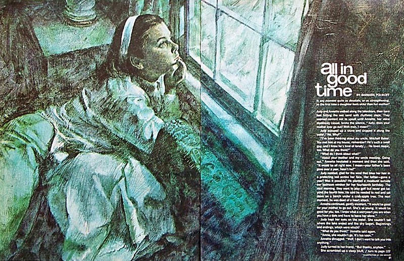
(Below, Joe Bowler DPS from McCall's, January 1967)
LP: I think what you were saying is you were willing to try new things but never willing to sacrifice the basics for the sake of gimmicks.
JB: Exactly right.
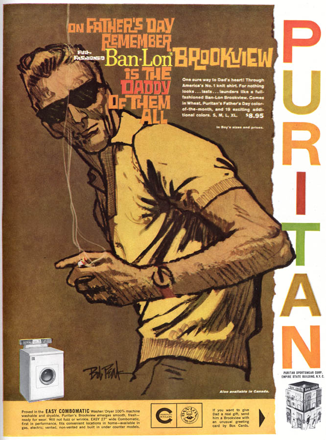
LP: So having said that; another guy came along around the same time as Bernie Fuchs and made a big splash: Bob Peak.
JB: Oh wow...
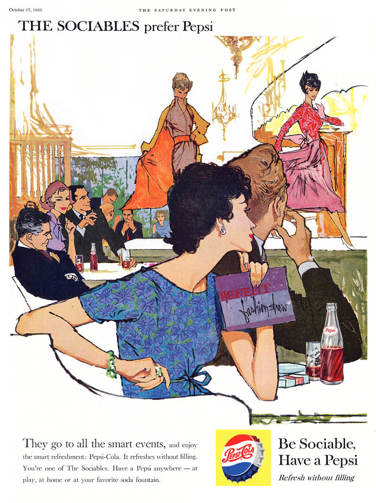
(Below, Bob Peak Pepsi ad, October 1959)
LP: So what I'm wondering is, did you notice Bob Peak's work and what did you think about it?
JB: Well, I liked the work very much. It was all his own. I just said to myself, this has got to be the best commercial illustrator I've ever seen. This guy could do anything and do it well. But as far as anybody I looked to for inspiration; no. Other than just realizing how good he was at what he did.
(Below, Bob Peak advertising art, late 1950s)
I did try a bit of everything at that time. I did a lot of just charcoal drawings with coloured ink washes and things like that, which were different, I guess, for me.
(Below, Joe Bowler illustration, year and publication unknown)
LP: The '60s were a difficult time for a lot of illustrators, but as the author of the American Artist article says, you're one of the handful who seems to have found a way to stay on top. Can you tell me a little about those times and how you managed to keep getting a steady stream of assignments?
JB: Well it was part of my philosophy of saying, "I'm going to do something that they'll always want." Whatever I was doing or thinking, it was working for me.

Continued tomorrow
* To see recent works by the artist, visit Joe Bowler's website
* Thanks to Isabel for allowing me to use a scan from her Joe Bowler set on Flickr in today's post. Thanks also to oldcarguy41 for allowing me to use a Bowler illustration from his Flickr image archives.
Great interview, Leif! Really enjoyed it so far, but this part struck most, especially the part on how he handled influences and keeping his own approach in such a situation. Very important lesson.
ReplyDeleteAnd throughout, a great example how fashions change but good work remains good work!
Fantastic interview!
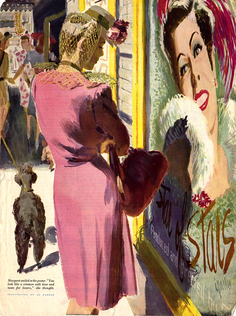
ReplyDeleteParker132 ~ The Matinee by Nancy Moore ; Ladies' home journal. Vol. 60, no. 4 (April, 1943)
Thanks, Leif and Joe. It's really interesting to put that moment of illustration together with all the various personalities and styles. The "cult of the new" seemed to be hitting the culture in a lot of different ways in the 1960s--popular music, advertising, gallery art, and illustration. Through it all, Joe kept his classic standards while still being fresh and new.
ReplyDeleteNice post, well written, easy to understand, I enjoyed it so much... waiting for the next one ... Thank you for this amazing post... Digital Marketing Institute in GTB Nagar
ReplyDeleteBest Eyelid Surgery in Delhi provided by PK Talwar
ReplyDeleteThanks for sharing us nice post procerus clinic provides FUE Hair Transplant in South Delhi
ReplyDeleteSkin Specialist Clinic in Delhi
Best Service provider company in Delhi
ReplyDeleteHair Baldness is not a big issue we have a best hair transplant technique to grow your hair again
ReplyDeleteNice post, well published, easy to understand, I have really enjoyed it. You can also know about Skin Treatment Clinic in south delhi
ReplyDeleteThanks for sharing us nice post
ReplyDeleteDr Sneha : Best Skin Specialist in Nashik
Thanks for sharing us nice post
ReplyDeleteDr Sneha : Best Skin Specialist in Nashik
Very Nice And Interesting Post, thank you for sharing
ReplyDeleteOwn Inspirational Quotes
Quality Excellence Quotes
Powerful World Quotes
Train Hard Gym Quotes
اقوال ممتازة
Future Oriented Quotes
Gain Independent Quoteslo
Gain Success Quotes
Good Exam Quotes
Belle Famose Citazioni
tanks a lot for comment and content
ReplyDeleteوکیل کیفری در اصفهان
وکیل خوب در اصفهان
وکیل خانواده در اصفهان
موسسه حقوقی در اصفهان
آجر نما
آجر سفال
آجر لفتون
وکیل طلاق توافقی در تهران
وکیل خانواده در تهران
Thanks, Leif and Joe. It's really interesting to put that moment of illustration together with all the various personalities and styles. difference between fue and fut
ReplyDelete